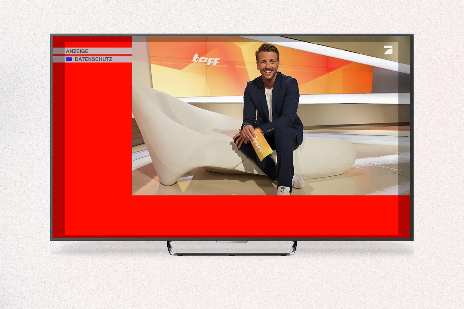
A SwitchIn is not a commercial, it is an image. It appears at the channel switch for around ten seconds as an L-banner around the running TV picture, without sound and without interrupting the programme. That means success is decided not by a film crew but by the design. And with the SwitchIn that design follows its own rules, because your banner appears exactly at the moment of the channel switch, when attention is high, and shares the screen with content people want to watch anyway.
What makes a SwitchIn special
The format is a form of addressable TV and runs over the HbbTV standard on internet-connected televisions. It is triggered by the switch moment, exactly when the viewer actively reaches for the remote and is especially attentive. The image runs silent, while the small live picture keeps running with sound. You do not need an elaborate video: a static image is enough, and for a bit more motion you can also deliver an animated GIF.
From this follow three things that every good design turns to its advantage. First, the moment: the channel switch reaches viewers in an instant of high attention that your banner can claim for itself. Second, the roughly ten seconds in which your message stands in the foreground, right next to the programme people want to watch. Third, the distance: it is seen from the sofa across several metres, so you design for the living room, not for the monitor.
Put your SwitchIn on screen!
Book a demoHow to design a SwitchIn that works
One message, one goal. The most common mistake is wanting too much. In ten seconds, exactly one statement sticks. Decide on the one thing the viewer should take away, and drop everything that distracts from it.
Large, legible type. Text has to be readable instantly from several metres away. That means few words, large type sizes and strong, clear fonts. Thin lines, body copy and fine print get lost on the TV.
Brand recognisable at once. Even if only two seconds stick, people should know who the message is from. Use your logo and brand colours clearly, ideally so the brand is recognised without reading.
High contrast, calm background. For the message to carry, it needs strong contrast between text and background. A calm, clear image works better than a cluttered one. White space is not wasted space, it helps the eye find what matters at once.
Design for the L-shape. Your area frames the TV picture, it does not cover it. Place the important elements, logo, message and call to action, clearly within the banner area and not at the very edge, where some devices crop. Think of the ad as a frame around a running picture, not as a full-screen poster.
Clear hierarchy. Lead the eye in three steps: first the brand, then the one message, then the call to action. This order should be recognisable at first glance, without the viewer having to search.
That this effort pays off is shown by gaze research: an eye-tracking study on the SwitchIn found attention spread fairly evenly across all three central elements over the ten seconds, across key verbal, call to action and key visual. None was overlooked, which for the design means all three have to work. What else eye-tracking reveals about the SwitchIn, and where this finding comes from, is in the article on SwitchIn eye-tracking.
Why the design carries so much weight is clear from advertising effectiveness overall: according to Nielsen, the creative accounts for around half of how strongly advertising works on sales. With the SwitchIn, where there is nothing but the image, that holds all the more. The big screen hands your banner people's gaze, and your design decides whether you hold it.
What a good SwitchIn looks like
How the principles come together is shown by three examples. What they share is that they focus on one product and one statement, show the brand clearly and keep the area calm.
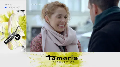 Tamaris: product and brand recognisable at once, one clear message.
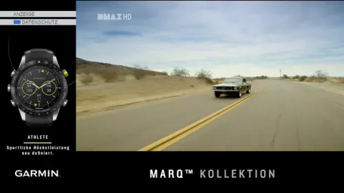 Garmin: one product in focus, high contrast, a calm area.
 Jewellery: a premium image that stages the brand elegantly.
The call to action without a click
A SwitchIn is not clicked, so the call to action has to work without a click. It works best with a clear time window: an offer valid only until a certain date, a promotion week, or an event everything leads up to. That gives a concrete reason to act now, and a simple next step to go with it, such as a visit to the local store or a search for your brand. A QR code is not suitable here, at the switch moment it does not get scanned.
Use the regional strength
The great advantage of the format is precise delivery, right down to the postal code. Use that in the design too. A SwitchIn showing your own town, the nearest branch or a regional offer feels instantly more relevant than a generic message. Because you can run different creatives for different regions, it pays to sharpen the message locally. How the targeting works exactly is shown in the article on regional targeting in streaming TV.
How to run it with onescreen
The practical advantage: a SwitchIn needs no video production, a clean image or an animated GIF is enough. It gets even easier with the Photoshop template you can download in the Ad Manager after a free registration. It already gives you the right dimensions and the areas for brand, message and call to action, so you only add your content.
Tip: With onescreen you can deliver your SwitchIn not only as a static image but also as an animated GIF. That adds a little motion to your creative, with no video production.
With onescreen you place it on the major channels, target by region, age, gender and interests, and see in the daily dashboard how your campaign is doing. The switch moment ensures your banner appears exactly when attention is high. Why relevant attention matters more than sheer reach is explored in the article Attention Over Reach.
Conclusion
A good SwitchIn lives on clarity. One message, large type, an instantly recognisable brand, high contrast and a call to action that works without a click. Those who design for the L-shape and the sofa distance, and use regional delivery creatively too, get the most out of ten seconds. The format does not require an expensive production, but good craft in the design.
Want to bring your first SwitchIn to the smart TV? Book a demo and we will show you how in 30 minutes. Or see the format directly on the SwitchIn page.
FAQ
What is a SwitchIn? A SwitchIn is an addressable TV ad format based on the HbbTV standard. At the channel switch, an L-banner appears for around ten seconds around the running TV picture, without sound and without interrupting the programme. It needs only an image, static or as an animated GIF, no commercial.
How should a SwitchIn be designed? Clear and reduced: one message, large and legible type, an instantly recognisable brand, high contrast and a simple call to action. The short viewing time of around ten seconds and the distance from the sofa are what matter, so less works better than more here.
Does a SwitchIn need a call to action if it is never clicked? Yes, but one that works without a click. A clear time window works best, such as an offer valid only until a certain date, combined with a simple next step like visiting the store or searching for your brand. A QR code is not suitable on the SwitchIn.
Do I have to produce a spot for a SwitchIn? No. A SwitchIn only needs an image, either static or as an animated GIF. That makes the format attractive especially for smaller budgets, because the costly video production is not needed.